What, how, and why of MFCCs
In the quest for compact representation of speech
MFCC stands for mel-frequency cepstral coefficient. In this tutorial we will understand the significance of each word in the acronym, and how these terms are put together to create a signal processing pipeline for acoustic feature extraction. The resulting features, MFCCs, are quite popular for speech and audio R&D. Why so? We will have an answer for this by the end of this notebook.
Say hi to our signal
It is good to understand by doing and hence, we will carry the below speech signal alongside us. Do listen to eat before we proceed.
#collapse
import numpy as np
import librosa
from IPython.lib.display import Audio
import matplotlib.pyplot as plt
from matplotlib.ticker import (MultipleLocator, FormatStrFormatter,
                               AutoMinorLocator)
from mpl_toolkits.axes_grid1 import make_axes_locatable


import seaborn as sns

fs = 16000
fname = 'nMIOAh7qRFf3pqbchclOLKbPDOm1_normal_count.wav'
dname = './my_data/'
# load
x, sr = librosa.load(dname+fname,sr=fs)
x = x/max(np.abs(x))
times = np.arange(0,len(x))/sr
# listen
Audio(x, rate=sr, autoplay=False)
Below is the time-domain representation. The duration of this signal is 3.64 seconds, and it has 58378 samples (or data points). Our goal is to represent these 58378 data points with fewer numbers (or a compact representation) and still preserve the essential features of the signal.
#collapse
# plot
print('Nos. samples: '+str(len(x)))
print('Duration: '+str(times[-1])+ 'seconds')

fig = plt.subplots(figsize=(12,2))
ax = plt.subplot(1,1,1)
ax.plot(times, x)
ax.grid(True)
plt.ylabel('amplitude [in A.U.]', fontsize=14)
plt.xlabel('time [in sec]', fontsize=14)
plt.xticks(fontsize=13)
plt.yticks(fontsize=13)
ax.spines['right'].set_visible(False)
ax.spines['top'].set_visible(False)
plt.show()
Signal non-stationarity
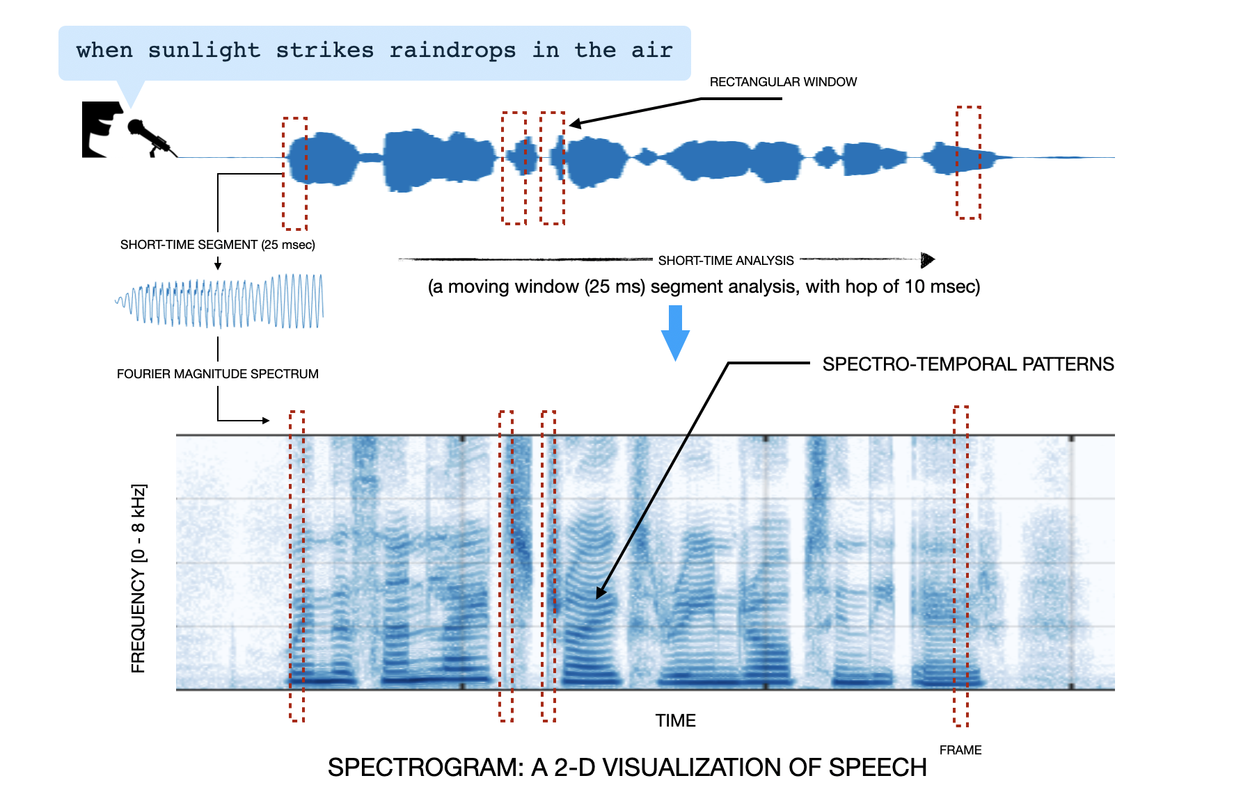
If you plot a speech signal waveform you will note that the waveform shape changes significantly over time. This time is not in months or years but in tens of milliseconds. You don't believe, right? See below image. It depicts a speech signal. From the signal we take a 25 msec segment, compute its magnitude Fourier transform, and push the output into a column of an empty matrix. Then we hop by 10 msec along the speech signal (from left to right), and again take a 25 msec segment, and repeat the procedure - magnitude fourier transform, push into the column of the matrix, and hop, till we reach the end of the speech signal. The resulting matrix is referred to as the spectrogram. We have plotted this matrix as an image (color bar:color gradient from dark blue to white indicates high to low amplitude in the spectral content). Spend some time staring at the spectrogram and you would notice the changing spectrum across time! In a more technical sense, this changing spectral content over time behavior of sound signals is referred to as signal non-stationarity. If you think philosophically, a reason we enjoy speech and music signals is due the non-stationarity in these signals. A sinusoid (like, a tone signal) will bore us very quickly.
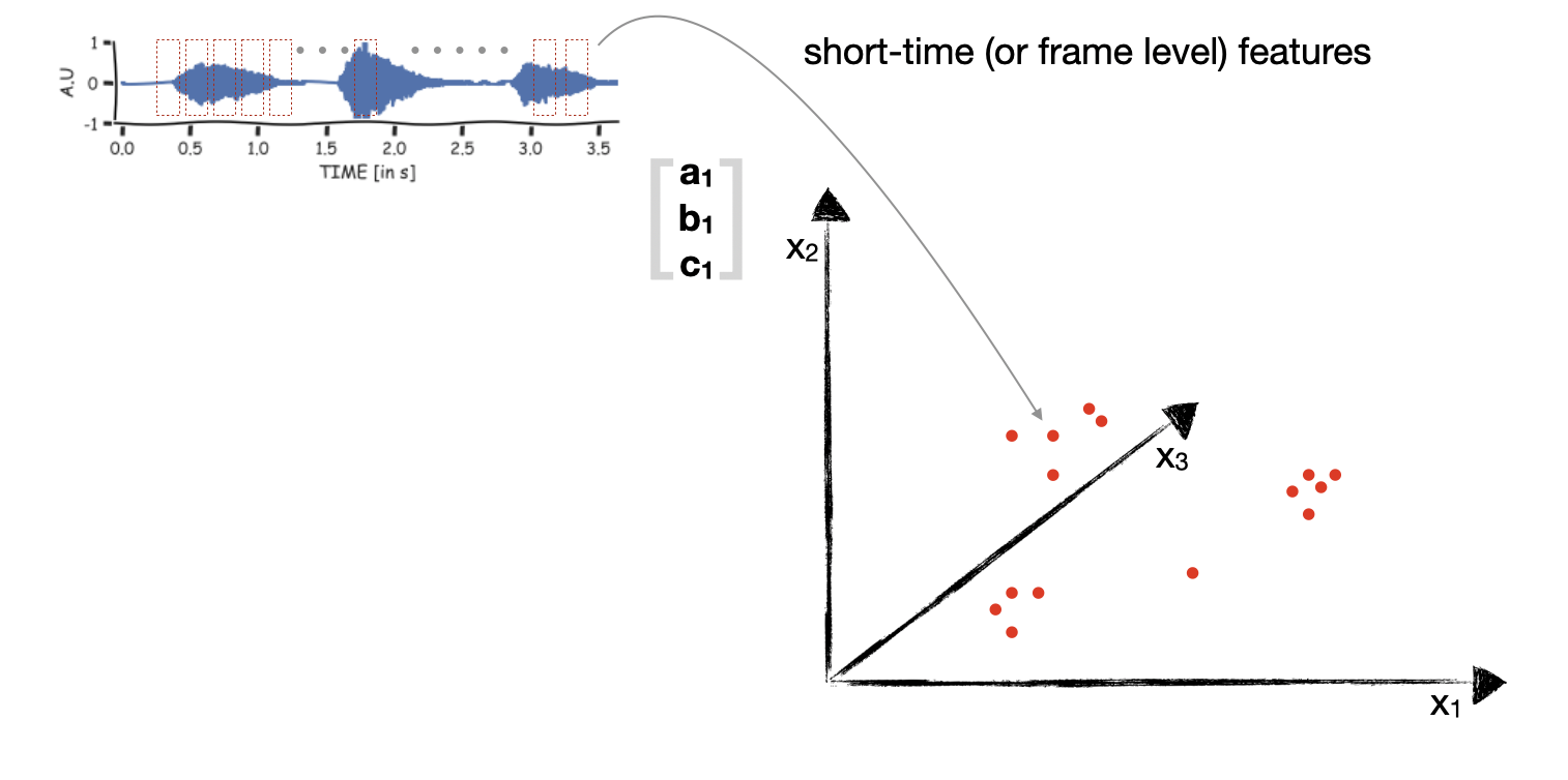
The worrying thing with signal non-stationarity is that the majority of statistics and signal processing methods are applicable to stationary signals. For instance, the methods assume that the underlying data distribution does not change over time (Ergodic process) or the Fourier spectrum stays the same. To apply these methods to speech and audio signals we will make use of short-time analysis. We will segment the audio signal into short-time segments (of duration windDur), and from each segment we will extract some compact representation. An illustration is shown in the below figure. Here, a 3-D representation is extracted from every short-time segment.

Windowing
When we take out a short-time segment from the full signal, the start and end of the short-time segment signal may have abrupt discontinuity. This will introduce spurious frequencies in the Fourier transform of the signal (more here). Hence, it is a usual practice to multiply the short-time segment with a window which tapers at start and end. Now because the window tappers at the ends, we will make the consecutive short-time segments overlap. This is controlled by hopDur. Below is the code to obtain short-time segments of the signal.
#collapse
def segment_signal(signal, winType='rect', winDur = 25e-3, hopDur=10e-3, sr=16e3):
    # hop_size in ms
    winLen = int(winDur*sr)
    hopLen = int(hopDur*sr)
    signal = np.pad(signal, winLen//2, mode='reflect')

    nframes = int((len(signal) - winLen) / hopLen) + 1
    frames = np.zeros((nframes,winLen))
    if winType == 'hamming':
        window = np.hamming(winLen)
        window = window-np.min(window)
        window = window/np.max(window)
    elif winType == 'rect':
        window = np.ones((winLen,),dtype=float)

    for n in range(nframes):
        frames[n] = window*signal[n*hopLen:n*hopLen+winLen]
    return frames

def nearestpow2(n):
    k=1
    while n>2**k:
        k = k+1
    return 2**k

hopDur = 10e-3 #ms
winDur = 25e-3

x_segs_rect = segment_signal(x, winType='rect', winDur=winDur, hopDur= hopDur, sr=sr)
x_segs_hamming = segment_signal(x, winType='hamming', winDur=winDur, hopDur= hopDur, sr=sr)


fix, ax = plt.subplots(2,2,figsize=(14,8))
indx = 155
nfft = nearestpow2(x_segs_rect.shape[1])
axis_freq = np.arange(0,nfft/2+1)*sr/nfft
axis_time = indx*hopDur+np.arange(0,x_segs_rect.shape[1],1)/sr

X_1 = 10*np.log10(np.abs(np.fft.rfft(x_segs_rect[indx,:],nfft)))
X_1 = X_1 - np.max(X_1)
X_2 = 10*np.log10(np.abs(np.fft.rfft(x_segs_hamming[indx,:],nfft)))
X_2 = X_2 - np.max(X_2)

ax[0][0].plot(axis_time,x_segs_rect[indx,:])
ax[0][0].grid(True)
ax[0][0].set_ylabel('AMPLITUDE [in A.U]', fontsize=14)
ax[0][0].set_xlabel('time [in secs]', fontsize=14)
plt.xticks(fontsize=13)
plt.yticks(fontsize=13)
ax[0][0].spines['right'].set_visible(False)
ax[0][0].spines['top'].set_visible(False)
ax[0][0].text(1.55,0.8,'After rectangular windowing')


ax[0][1].plot(axis_time,x_segs_hamming[indx,:])
ax[0][1].grid(True)
ax[0][1].set_ylabel('AMPLITUDE [in A.U]', fontsize=14)
ax[0][1].set_xlabel('time [in secs]', fontsize=14)
plt.xticks(fontsize=13)
plt.yticks(fontsize=13)
ax[0][1].spines['right'].set_visible(False)
ax[0][1].spines['top'].set_visible(False)
ax[0][1].text(1.55,0.8,'After hamming windowing')

ax[1][0].plot(axis_freq,X_1)
ax[1][0].grid(True)
ax[1][0].set_ylabel('MAGNITUDE SPECTRUM [in dB]', fontsize=14)
ax[1][0].set_xlabel('frequency [in Hz]', fontsize=14)
plt.xticks(fontsize=13)
plt.yticks(fontsize=13)
ax[1][0].spines['right'].set_visible(False)
ax[1][0].spines['top'].set_visible(False)
ax[1][0].text(1.55,0.8,'After rectangular windowing')


ax[1][1].plot(axis_freq,X_2)
ax[1][1].grid(True)
ax[1][1].set_ylabel('MAGNITUDE SPECTRUM [in dB]', fontsize=14)
ax[1][1].set_xlabel('frequency [in Hz]', fontsize=14)
plt.xticks(fontsize=13)
plt.yticks(fontsize=13)
ax[1][1].spines['right'].set_visible(False)
ax[1][1].spines['top'].set_visible(False)
ax[1][1].text(1.55,0.8,'After hamming  windowing')


ax[1][0].set_ylim(-40,5)
ax[1][1].set_ylim(-40,5)
plt.show()
The consecutive short-time segments may have significant correlations. Lets visualize this by plotting the covariance matrix of x_segs_hamming. Below we visualize only a part of the correlation matrix. The brighter colors indicate high correlation (diagonal values are 1). We can see some blocks of high correlation. This is likely because the speech signal has burst of vocal activity (spokenn digits), with pauses in between.
#collapse
x_segs = x_segs_hamming.copy()
C = np.zeros((x_segs.shape[0],x_segs.shape[0]))
# C = np.dot(x_segs.T,x_segs)
C.shape
for i in range(x_segs.shape[0]):
    for j in range(x_segs.shape[0]):
        C[i,j] = np.dot(x_segs[i,:],x_segs[j,:])/np.linalg.norm(x_segs[i,:])/np.linalg.norm(x_segs[j,:])

fig = plt.subplots(figsize=(12,6))
ax = plt.subplot(1,1,1)
# ax.plot(C[110,:])
ax.imshow(np.abs(C[100:200,100:200]))
plt.show()
We hear spectral energies
Compute Fourier transform
Why? Psychoacoustic and physiology studies of the auditory system of human and animals have shown that we are sensitive to individual frequencies contained in the sound pressure variation. Hence, it makes sense to transform every short-time segment into corresponding Fourier spectrum representation. This is straight forward using the FFT implementation available in python. One thing to focus on here is the nfft length. This should be at least equal to winLen to get a meaningful FFT of each segment.
Compute spectral energies
The output of FFT is a complex vector. Psychoacoustic studies have shown that our hearing is sensitive to energy distribution across the frequencies. So, we compute the energy by taking the absolute values. Below is the code for the above two things
#collapse
X = np.zeros((x_segs.shape[0],int(nfft/2)+1))
X = np.abs(np.fft.rfft(x_segs,nfft,axis=1))**2
Further, we hear in mel-scale
Mel-scale transformation of frequencies
There is a phenomenal psychoacoustic work which has attempted to quantify the mapping between the frequency scale obtained from Fourier transform and that perceived by our brain.
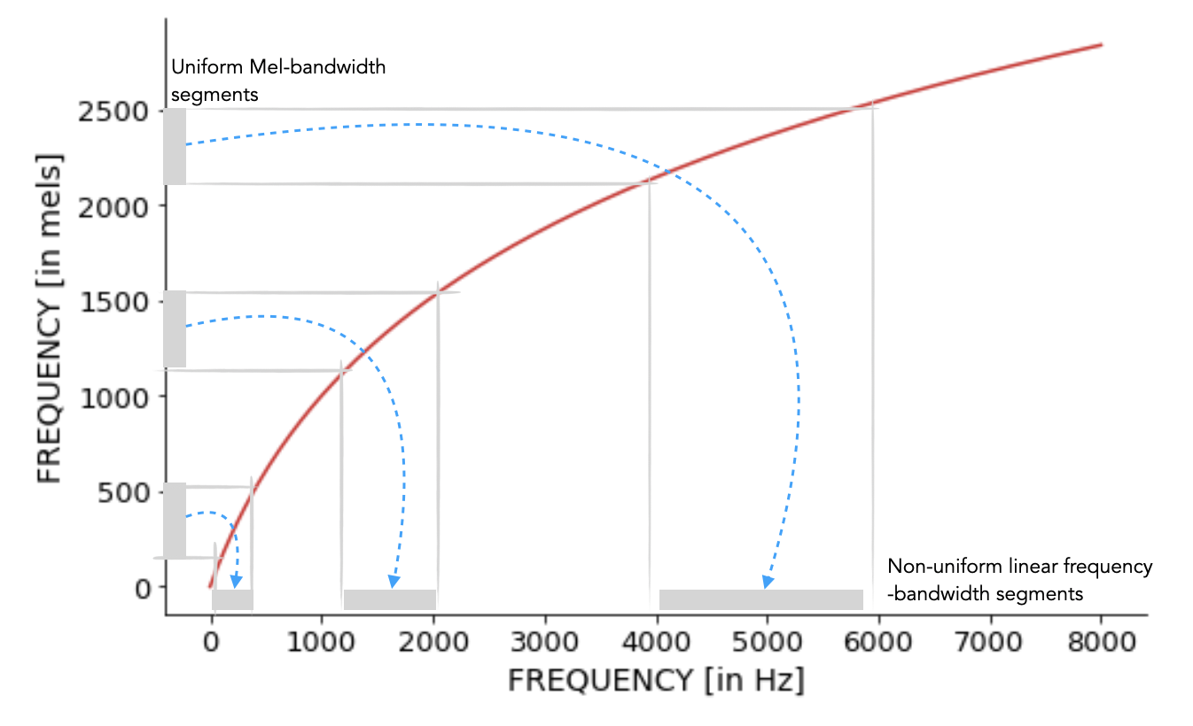
Volkmann and Stevens worked on constructing a scale that reflected how people hear musical tones. Listeners were asked to adjust tones so that one tone (a sinusoidal signal of specific frequency) was half as higher as another, and other such subdivisions of the frequency range. This way the mel scale (mel stands for melody) was obtained. You can read more in this article. A standard definition of mel-scale is: a perceptual scale of pitches judged by listeners to be equal in distance from one another. The reference of 1000 mels was assigned as having a frequency of 1000 Hz (at 40 dB above threshold). The below code visualizes this mapping. We can make the following quick observations:
- the mapping is non-linear
- monotonically increasing in shape
- close to linear till 1000 Hz
- beyond 1000 Hz it is highly compressive This implies doubling in the linear scale does not result in doubling in the mel-scale!
#collapse
def freq_to_mel(freq):
    # converting linear scale frequency to mel-scale
    return 2595.0 * np.log10(1.0 + freq / 700.0)

def mel_to_freq(mels):
    # converting mel-scale frequency to linear scale
    return 700.0 * (10.0**(mels / 2595.0) - 1.0)

axis_freqs = np.arange(0,nfft/2+1)/nfft*sr
mels = freq_to_mel(axis_freqs)

fig = plt.subplots(figsize=[8,5])
ax = plt.subplot(1,1,1)
ax.plot(axis_freqs,mels, color='tab:red')
ax.plot(axis_freqs[:100],axis_freqs[:100],'--',color='gray')
ax.grid(True)
ax.set_ylabel('FREQUENCY [in mels]', fontsize=14)
ax.set_xlabel('FREQUENCY [in Hz]', fontsize=14)
plt.xticks(fontsize=13)
plt.yticks(fontsize=13)
ax.spines['right'].set_visible(False)
ax.spines['top'].set_visible(False)
ax.text(3000,1500,'mel-scale warping',fontsize=14)
plt.show()
Designing a spectral energy weighting filterbank
Remember, our goal is to achieve a compact representation of the speech signal. We have some M (equal to 365) frames, each of dimension 257. Is there a way to reduce the dimension 257 to N, something smaller?
Yes, we can make N bins along 1 to 257, and sum the spectral energy in each of these bins. We will get N numbers and thus would have reduced the 257 dimension to N. Now the key questions are:
- What should be the size of these bins?
- Should these be of uniform sizes from 1 to 257?
The frequency warping from linear to mel-scale suggests that non-uniform size bins should be preferred, with the size of the bins gradually increasing. So, we make uniform bins in the mel frequency scale, and this will result in corresponding non-uniform size bins in the linear frequency scale. The figure below shows an illustration for this.

Once we have the binning. Next question is what kind of weighting should we apply to the energies in these bins. A preferred choice is triangular weighting. This will then also imply that we should make the consecutive bins have an overlap 50%. The below code implements these steps and creates the spectral energy weighting filterbank. This is also widely referred to as the mel-scale uniform bandwidth filterbank. Also, it is good to normalize the area under each filter weighting function. This makes the relative peak strength of the filters decrease as we go towards higher center frequency filters.
#collapse
freq_min = 0
freq_high = sr / 2
mel_filter_num = 40

def get_filter_points(fmin, fmax, mel_filter_num, nfft, sample_rate=16000):
    fmin_mel = freq_to_mel(fmin)
    fmax_mel = freq_to_mel(fmax)

    mels = np.linspace(fmin_mel, fmax_mel, num=mel_filter_num+2)
    freqs = mel_to_freq(mels)

    return np.floor((nfft) / sample_rate * freqs).astype(int), freqs

def get_filters(filter_points, nfft):
    filters = np.zeros((len(filter_points)-2,int(nfft/2+1)))

    for n in range(len(filter_points)-2):
        filters[n, filter_points[n] : filter_points[n + 1]] = np.linspace(0, 1, filter_points[n + 1] - filter_points[n])
        filters[n, filter_points[n + 1] : filter_points[n + 2]] = np.linspace(1, 0, filter_points[n + 2] - filter_points[n + 1])

    return filters


filter_points, freqs = get_filter_points(freq_min, freq_high, mel_filter_num, nfft=nfft, sample_rate=sr)
filters = get_filters(filter_points, nfft=nfft)

fig = plt.subplots(figsize=[16,5])
ax = plt.subplot(1,2,1)
for n in range(filters.shape[0]):
    ax.plot(axis_freqs,filters[n])
ax.grid(True)
ax.set_ylabel('WEIGHTING [in A.U]', fontsize=14)
ax.set_xlabel('FREQUENCY [in Hz]', fontsize=14)
plt.xticks(fontsize=13)
plt.yticks(fontsize=13)
ax.spines['right'].set_visible(False)
ax.spines['top'].set_visible(False)
ax.text(3000,1.1,'uninform mel-bandwidth filterbank',fontsize=14)


# normalizing the filter weighting based on area
enorm = 2.0 / (freqs[2:mel_filter_num+2] - freqs[:mel_filter_num])
filters *= enorm[:, np.newaxis]

ax = plt.subplot(1,2,2)
for n in range(filters.shape[0]):
    ax.plot(axis_freqs,filters[n])
ax.grid(True)
ax.set_ylabel('WEIGHTING [in A.U]', fontsize=14)
ax.set_xlabel('FREQUENCY [in Hz]', fontsize=14)
plt.xticks(fontsize=13)
plt.yticks(fontsize=13)
ax.spines['right'].set_visible(False)
ax.spines['top'].set_visible(False)
ax.text(3000,.0055,'filter area normalized',fontsize=14)
plt.show()
Applying the filterbank
Once we have the filter bank we apply this to the magnitude FFT X to transform 257x357 to Nx357. Here, N will be equal to the number of mel filters (mel_filter_num) in the filterbank. Also, we apply a log to the output values. This is because you would have noticed that you can hear faint and loud sounds. Applying log transformation will help us amplify the low energy values and attenuate little bit the high amplitude values (to know more, you can read about it more here - Weber-Fechner Law).
X_filtered = np.dot(filters, X.T)
X_filtered_log = 10.0 * np.log10(X_filtered)

fig = plt.subplots(figsize=[16,5])
ax = plt.subplot(1,2,1)
ax.imshow(10*np.log10(X.T),origin='lower',aspect='auto',cmap='RdBu_r')
ax.grid(True)
ax.set_ylabel('linear frequency FFT bin', fontsize=14)
ax.set_xlabel('short-time frame index', fontsize=14)
plt.xticks(fontsize=13)
plt.yticks(fontsize=13)


ax = plt.subplot(1,2,2)
ax.imshow(X_filtered_log,origin='lower',aspect='auto',cmap='RdBu_r')
ax.grid(True)
ax.set_ylabel('filter index', fontsize=14)
ax.set_xlabel('short-time frame index', fontsize=14)
plt.xticks(fontsize=13)
plt.yticks(fontsize=13)
plt.show()
Decorrelation
Decorrelating filterbank outputs
The following are some data analysis convenience steps, and (likely) not what happens inside the ear or brain. These steps will help us to further reduce the dimension from Nx357 to Kx357 where K < N. Remember, our goal is to obtain a compact representation.
Lets try to see if there is correlation across the filter outputs. If there is, we can reduce the dimension further. How to go ahead? We will do a PCA on X_scaled and visualize the decrease in explained variance across components. You can see in the figure below it does drop sharply, and likely 5 components suffice to capture most of the data variance.
#collapse
pca = PCA(n_components=X_scaled.shape[0])
pca.fit(X_scaled.T)

fig = plt.subplots(figsize=[8,5])
ax = plt.subplot(1,1,1)
ax.plot(pca.explained_variance_ratio_,'-o')
ax.grid(True)
ax.set_ylabel('explained variance', fontsize=14)
ax.set_xlabel('PCA component', fontsize=14)
plt.xticks(fontsize=13)
plt.yticks(fontsize=13)
ax.spines['right'].set_visible(False)
ax.spines['top'].set_visible(False)
plt.show()
Lets also visualize how the principal components look. These look a little oscillatory.
fig = plt.subplots(figsize=[12,10])
for i in range(5):
    ax = plt.subplot(5,1,i+1)
    ax.plot(pca.components_[i,:])
    ax.set_ylabel('PCA- '+str(i+1), fontsize=14)
    plt.xticks(fontsize=13)
    plt.yticks(fontsize=13)
    ax.spines['right'].set_visible(False)
    ax.spines['top'].set_visible(False)
Drawn by this observation and make our next linear transformation data independent, we can use the discrete cosine transform.
#collapse
def dct(dct_filter_num, filter_len):
    basis = np.empty((dct_filter_num,filter_len))
    basis[0, :] = 1.0 / np.sqrt(filter_len)

    samples = np.arange(1, 2 * filter_len, 2) * np.pi / (2.0 * filter_len)

    for i in range(1, dct_filter_num):
        basis[i, :] = np.cos(i * samples) * np.sqrt(2.0 / filter_len)

    return basis

dct_basis = dct(40,40)
fig = plt.subplots(figsize=[16,4])
ax = plt.subplot(1,1,1)
for i in range(10):
    ax.plot(dct_basis[i,:])
plt.ylabel('DCT basis amplitudes')
plt.xticks(fontsize=13)
plt.yticks(fontsize=13)
ax.spines['right'].set_visible(False)
ax.spines['top'].set_visible(False)
We apply the DCT transform to the X_filtered_log and the result thus obtained is called MFCCs. The MFCC[0], the first element in the vector obtained after DCT captures the spectral energy across the filterbank, for each short-time frame. This can be seen in the plot below. Interpreting the other dimensions of MFCCs is not straight forward. Also, the visualization does not mean much. But this compact representation is very useful as feature vectors for classification algorithms.
#collapse
dct_filter_num = X_scaled.shape[0]
dct_filters = dct(dct_filter_num, X_filtered_log.shape[0])
cepstral_coefficents = np.dot(dct_filters, X_filtered_log)

fig = plt.subplots(figsize=[16,5])
ax = plt.subplot(1,2,1)
ax.imshow(X_filtered_log,origin='lower',aspect='auto',cmap='RdBu_r')
ax.grid(True)
ax.set_ylabel('filter index', fontsize=14)
ax.set_xlabel('short-time frame index', fontsize=14)
plt.xticks(fontsize=13)
plt.yticks(fontsize=13)

ax = plt.subplot(1,2,2)
ax.imshow(cepstral_coefficents,origin='lower',aspect='auto',cmap='RdBu_r')
ax.grid(True)
ax.set_ylabel('MFCCs', fontsize=14)
ax.set_xlabel('short-time frame index', fontsize=14)
plt.xticks(fontsize=13)
plt.yticks(fontsize=13)
plt.show()

fig = plt.subplots(figsize=[16,5])
ax = plt.subplot(1,2,1)
ax.plot(cepstral_coefficents[0,:])
ax.grid(True)
ax.set_ylabel('MFCC[0]', fontsize=14)
ax.set_xlabel('short-time frame index', fontsize=14)
ax.spines['right'].set_visible(False)
ax.spines['top'].set_visible(False)
plt.xticks(fontsize=13)
plt.yticks(fontsize=13)

ax = plt.subplot(1,2,2)
ax.imshow(cepstral_coefficents[1:,:],origin='lower',aspect='auto',cmap='RdBu_r')
ax.grid(True)
ax.set_ylabel('MFCCs[1:39]', fontsize=14)
ax.set_xlabel('short-time frame index', fontsize=14)
plt.xticks(fontsize=13)
plt.yticks(fontsize=13)
plt.show()
Summary
We obtained a compact representation of the speech signal we started with.
- Specifically, the 3.64 seconds signal with 58378 samples is now represented by 40x357 = 14280 samples. This is close to 1/4 of the original sample size. We can reduce it further by just picking only the first 11 MFCCs (as we noticed that the explained variance falls very rapidly, and 11 is also a common choice in the speech processing application domain). We then have a further compact representation of size, 11x357 = 3927, and this is a splendid compression by a factor close to 15x.
- Further, our compact representation is based on some insights from psychoacoustic studies.
What makes MFCCs popular:
- Its implementation is quite easy in a data processing pipeline. It makes use of simple and efficient operations such as FFT, logarithms, and DCT.
- The mel-scale is drawn from psychoacoustics studies. It is always inspiring to make use of some operation which is also hypothesized (and proven at least for tones) to be used by our perception.
To give us a feedback please us the comment box below.
References
If you are interested to know more, the below references will be useful.
- The excellent discussion section in L. C. W. Pols, H. R. C. Tromp, and R. Plomp Frequency analysis of Dutch vowels from 50 male speakers, 1972.
Stan W. Davis, P. Mermelstein, Comparison of Parametric Representations for Monosyllabic Word Recognition in Continuously Spoken Sentences, 1980.
This post at Kaggle served both as a motivation and improve the understanding to write the notebook. The mel filterbank design code segment is taken from this notebook.
